

Team structure
Project Manager(India & US) | Design Manager(India) I 6 UX Designers | 3 UI Designers | Sr. Manager Technology | 2 Design System Owners (Yup that's me!)
My role
Curated a comprehensive design system foundation with like color palettes, shadow styles, spacing guidelines, and icon libraries.
Developed a robust variable and token system with clear naming conventions and detailed configurations.
Conducted thorough component analysis as he collaborated with POD owners to identify specific component needs across various UX flows.
Built adaptable and scalable master components by designing flexible components that could be easily modified to suit project requirements.
Provided comprehensive documentation with covering usage best practices, component anatomy, and other essential information.
Worked directly with developers to facilitate the implementation of design system components using Storybook.
Client
Publicis Groupe
Project timeline
Jul 2024 - Sep 2024
Industry
Information Technology
Tools used

Did we do branding as well ?
Nope, branding was out of scope for this project as we were following the brand guidelines of 'Marcel', an online AI platform for Publicis Groupe's internal employees.
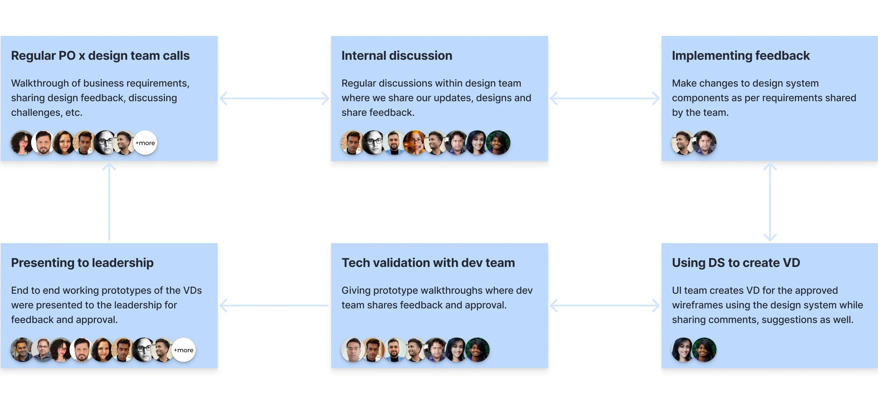
How we used to work
On a broader scale, this is how we worked but it was very flexible and full of MS Teams calls, yeah!
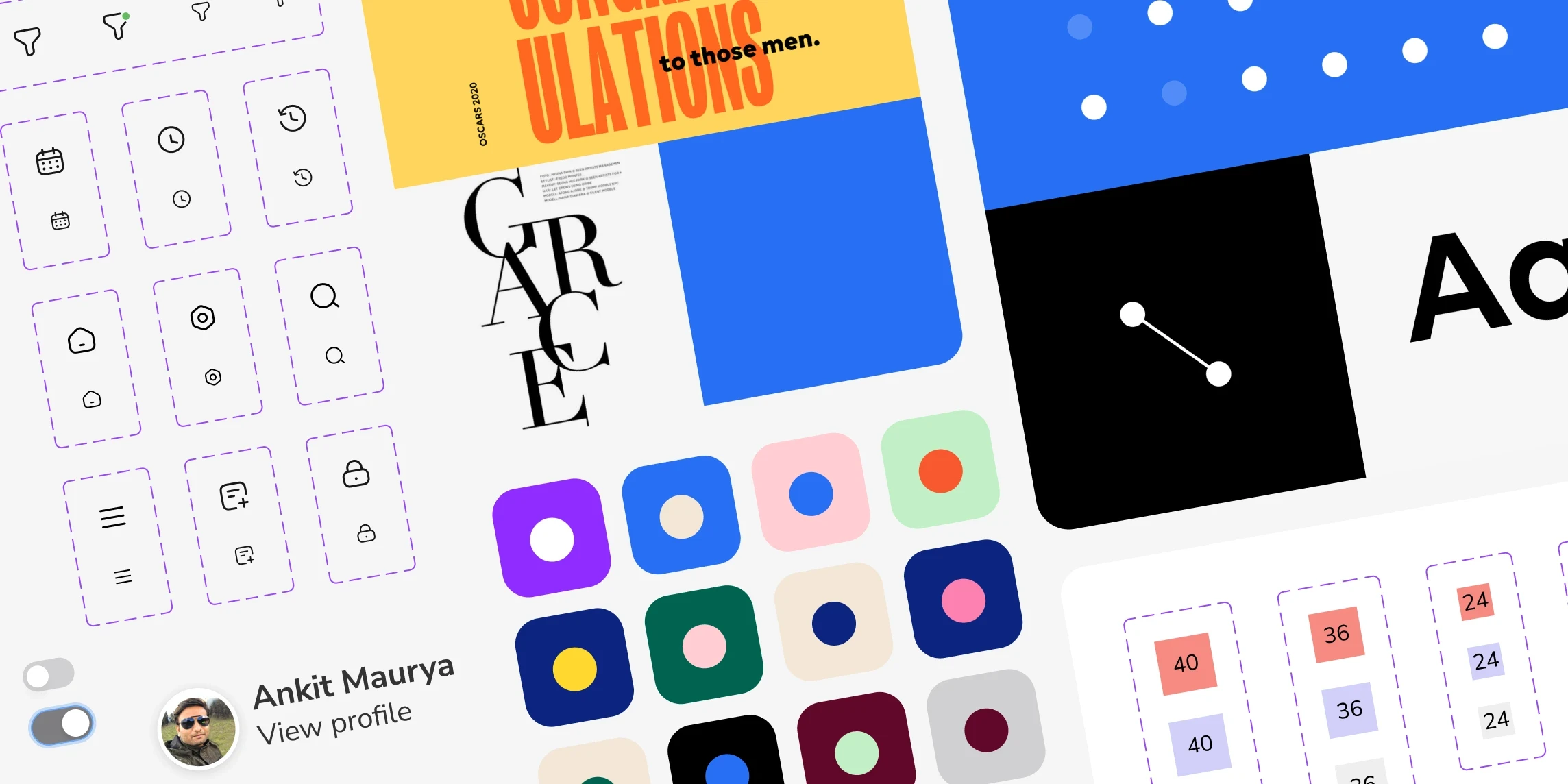
Fundamental components
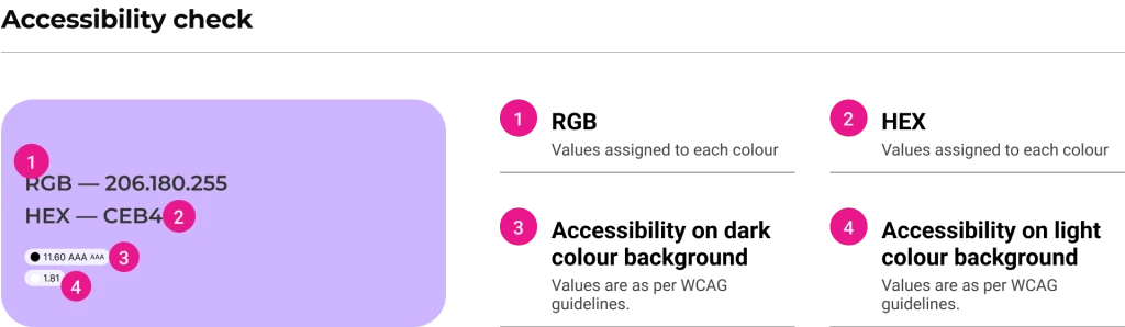
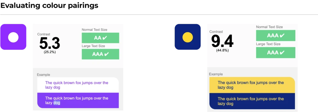
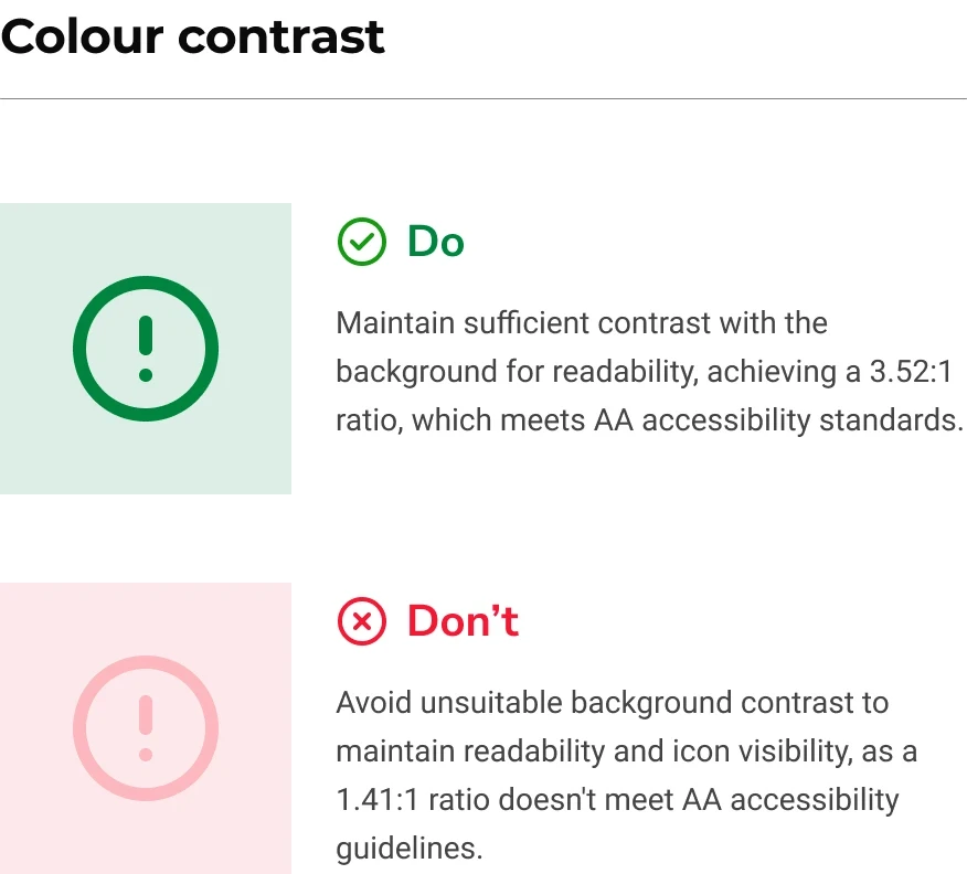
Colours
Primary, secondary, tertiary, functional, and text colour palettes.

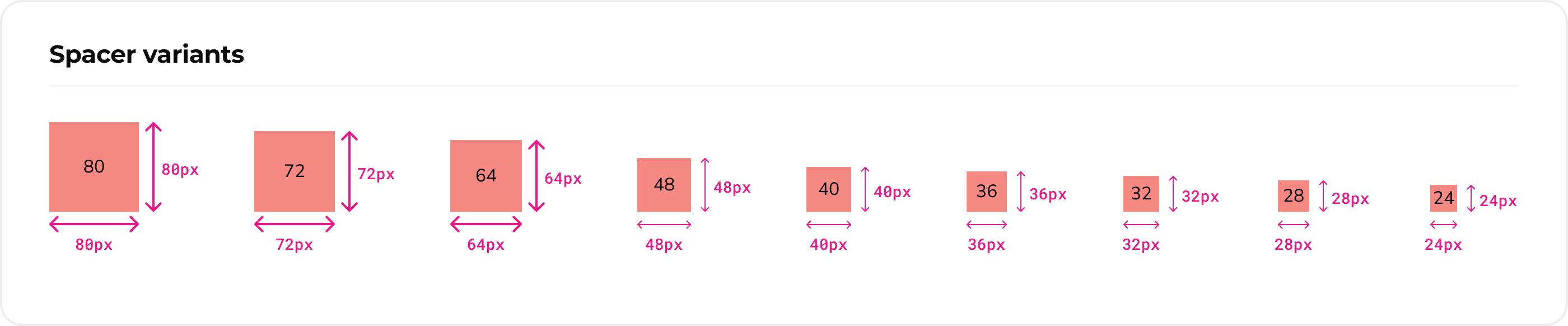
Spacers
Helps maintain consistent spacing and layout across different elements, components and pages in an interface.
Icons
Thin line icon library by Linetemp.
Imagery
Exudes attributes such as dynamic, dominant, hero, courageous and strong.
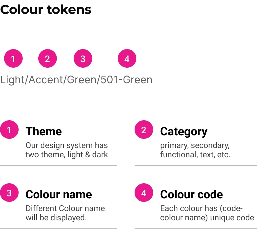
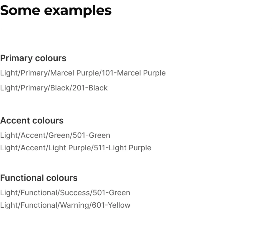
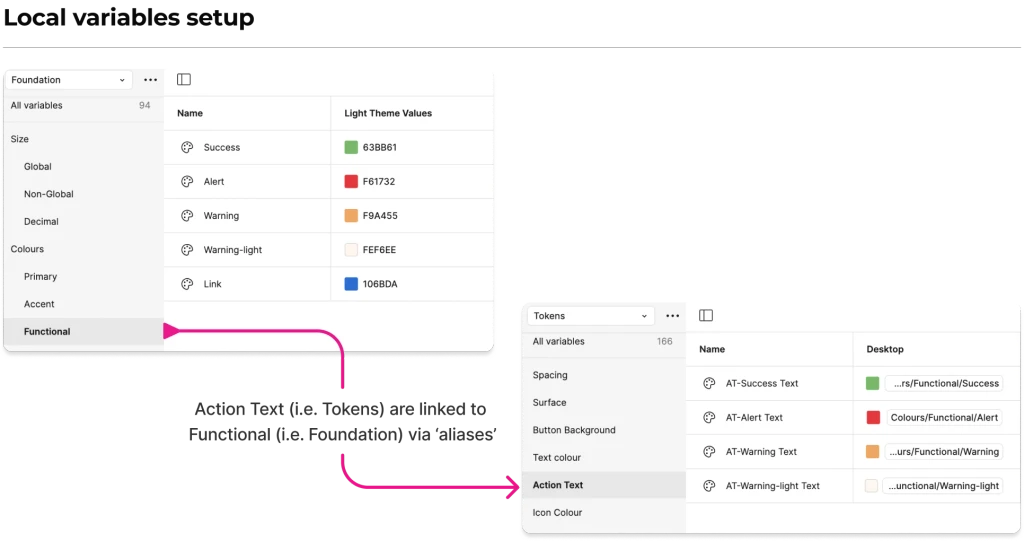
Token library
This was essentially the backbone of our design system.
Everything was happening all at once!
It was clear to me that anyone who was reviewing the hi-fi designs was not much focused on the atomic level changes that needed to be done in the design system.

Project Impact of the Problem
Increased man-hours were being spent on design system maintenance as the number of components grew.
To address this issue, my PM began discussing the possibility of hiring more designers.
But even if we had hired more people, the problem would have persisted due to our files experiencing increased loading times, frequent crashes, and constant "storage full" notifications.
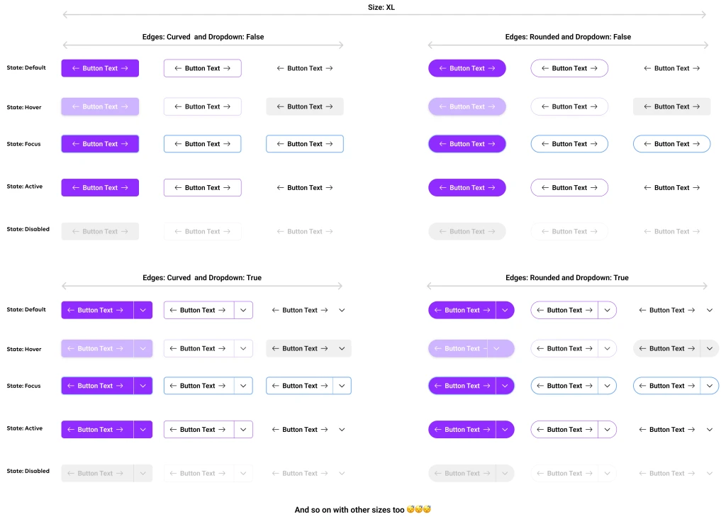
Our approach to creating DS sucked!
Let me prove it using math and show you why:
If Size count = 6 (i.e. XL, L, Base, S, XS)
State count = 5 (i.e. Default, Hover, Focus, Active, Disabled)
Edge count = 2 (i.e. Curved or Rounded)
Dropdown type = 2 (i.e. True or False)
Layers used for making single component = 9 layers
Then,
Total number of components in Button component = 300
Total number of layers used in making 300 components = 2700 layers
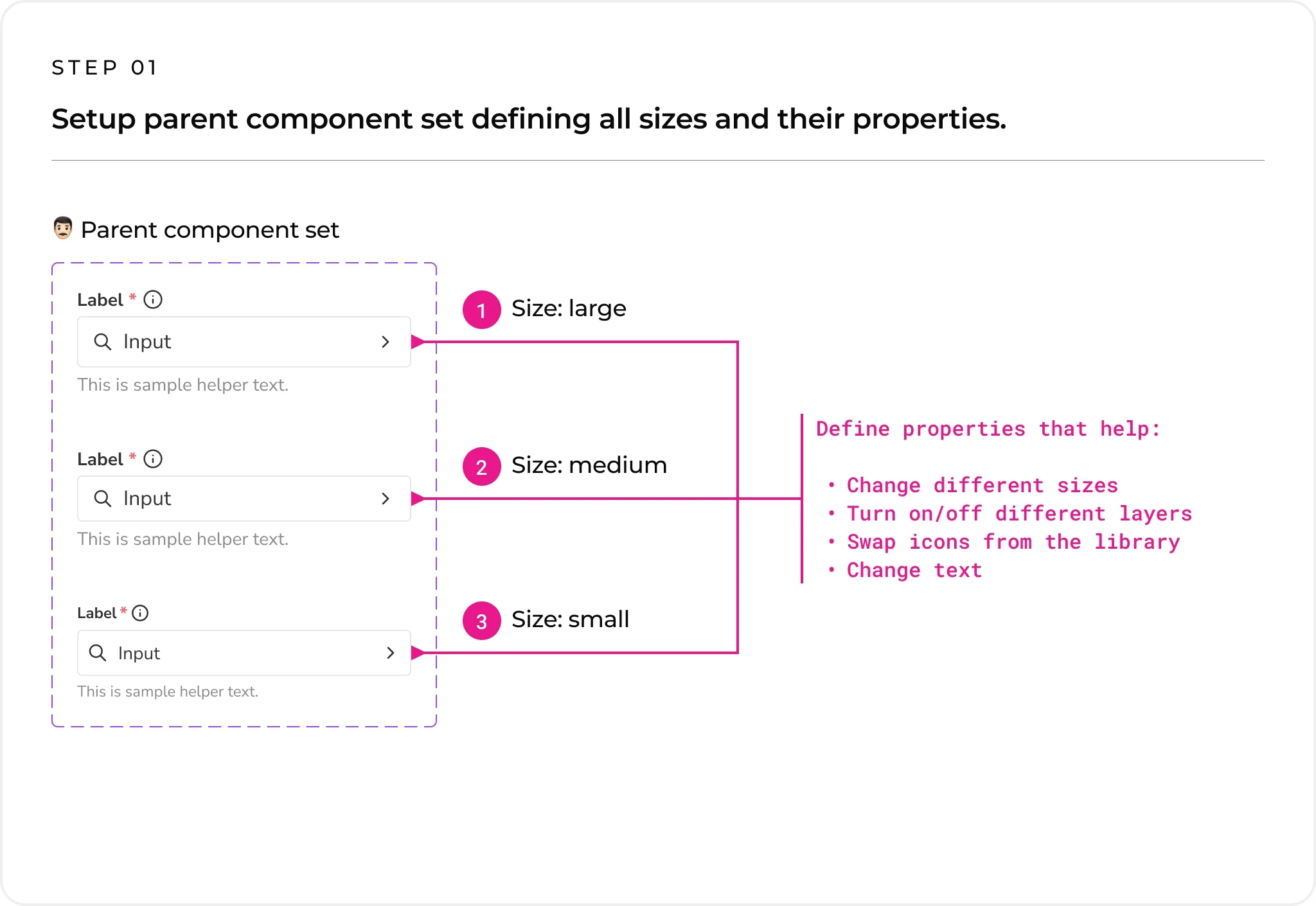
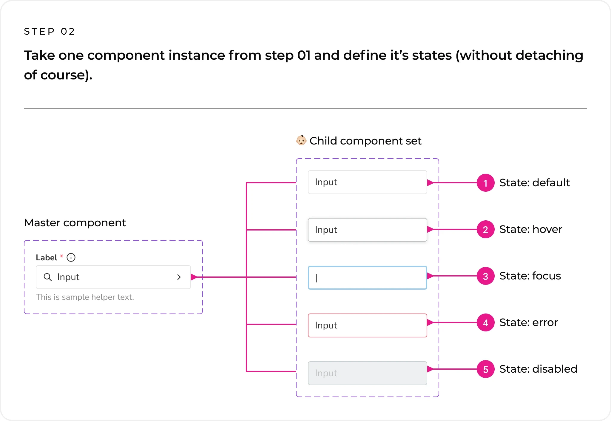
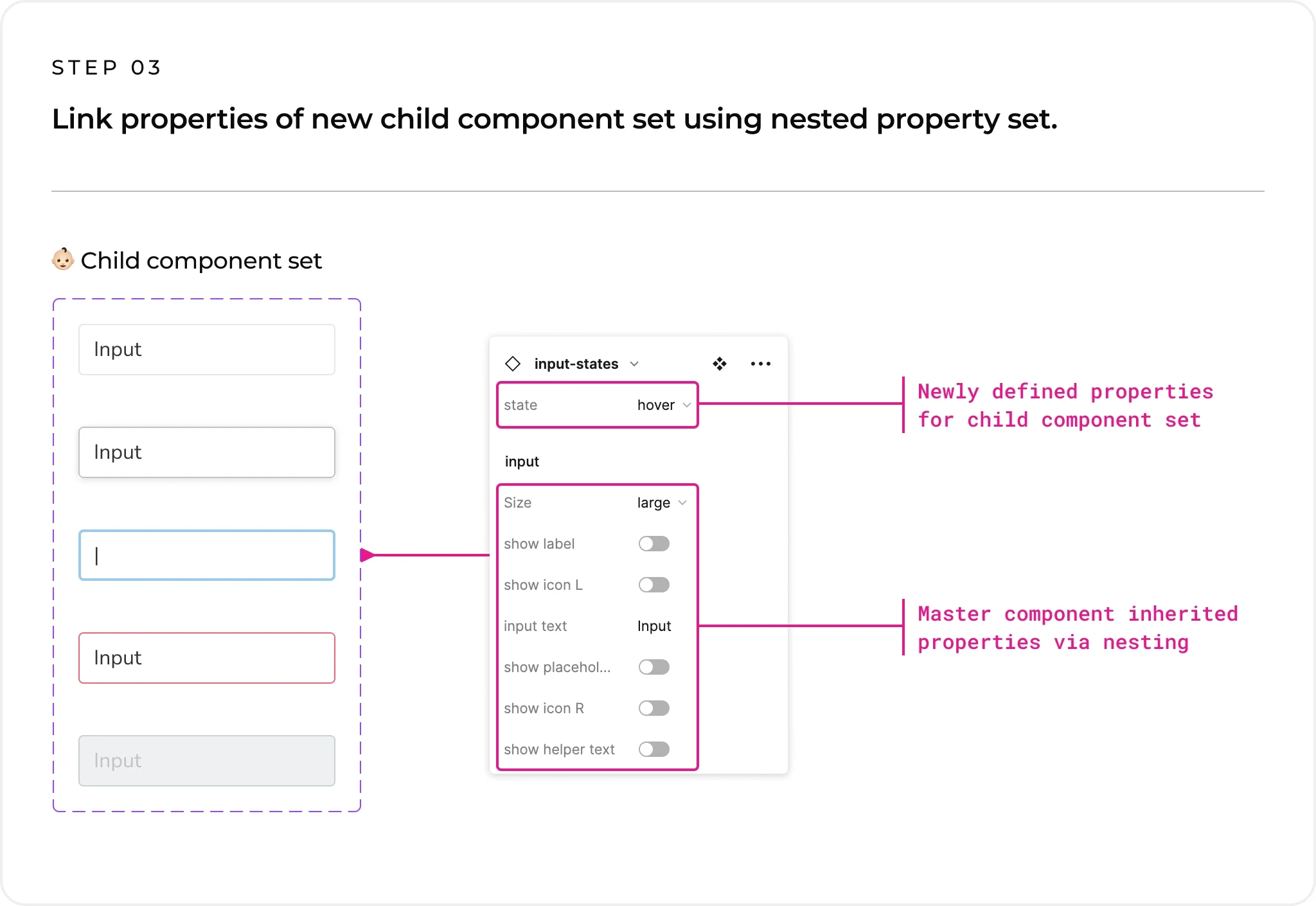
How I proposed we handle the situation!

3 step process
Below is a mini example of input component that was made using above mentioned approach.
Impact of my proposed new approach
91.67%
Reduction in no. of components from 300 down to just 25
91.67%
Reduction in no. of layers
from 2700 down to just 225
This atomic level change in our design system proved instrumental in creating a sustainable design system that was flexible to use and easy to implement.


What all was covered ?
We documented every component, detailing its structure, spacing, properties, states, and more.
Structure breakdown

Spacing details

Property description

Testimonial

Sanjeev Hegde
UX Lead @Publicis Sapient
"It has been an absolute pleasure having you as part of our team. Your dedication to mastering design systems and modern design practices has been truly inspiring and had a last lasting impact on the project overall."

Tara Singh
Senior Designer, L2 @Publicis Sapient
"I enjoyed working with Ankit, whose deep understanding of design systems and exceptional communication skills greatly contributed to our project's success. A talented designer and a compelling speaker, he consistently inspires and elevates team collaboration in a very positive manner."
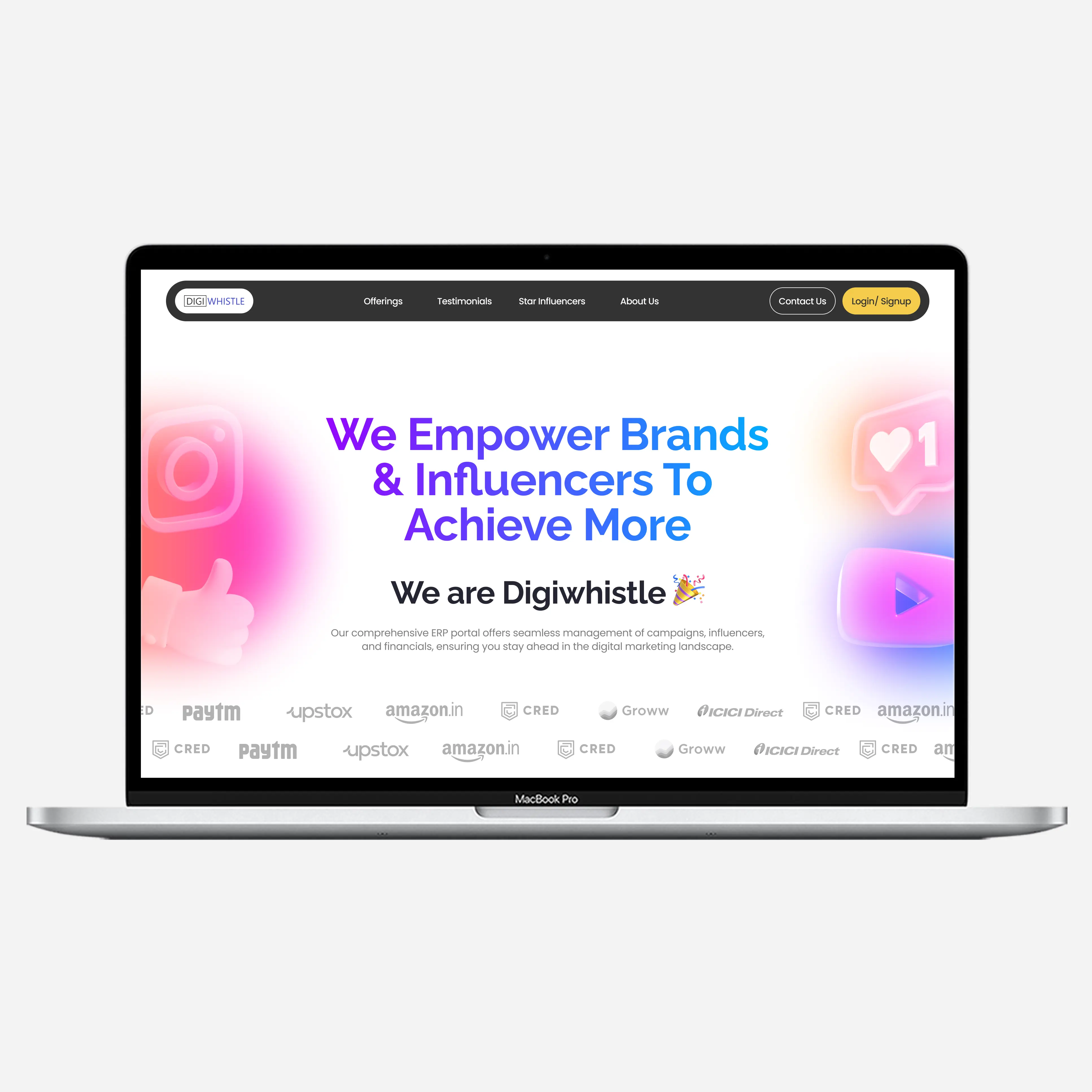
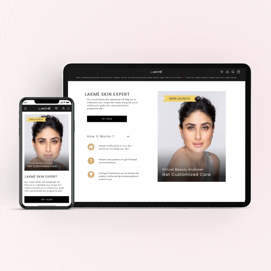
B2C Ai Web application | Consumer products